> ## Documentation Index
> Fetch the complete documentation index at: https://wb-21fd5541-dbrian-docs-serverless-training-quickstart.mintlify.site/llms.txt
> Use this file to discover all available pages before exploring further.
> 머신 러닝 실험에서 플롯을 생성하고 추적합니다.
# 실험에서 플롯 생성 및 추적
W\&B Models에서 `wandb.plot` 메서드를 사용하면 `wandb.Run.log()`로 차트를 추적할 수 있으며, 여기에는 트레이닝 중 시간에 따라 변하는 차트도 포함됩니다. 맞춤형 차트 프레임워크에 대해 자세히 알아보려면 [맞춤형 차트 워크스루](/ko/models/app/features/custom-charts/walkthrough/)를 참조하세요.
### 기본 차트
W\&B 차트를 만들려면 다음 단계를 따르세요.
1. `wandb.Table` 객체를 만들고 시각화할 데이터를 추가합니다.
2. W\&B에서 기본 제공하는 [도우미 함수](/ko/models/ref/python/custom-charts) 중 하나를 사용해 플롯을 생성합니다.
3. `wandb.Run.log()`로 플롯을 로깅합니다.
다음 기본 차트는 메트릭과 결과를 간단히 시각화하는 데 사용할 수 있습니다.
임의의 축에 연결된 순서 있는 점 목록으로 구성된 맞춤형 선형 플롯을 기록합니다.
```python theme={null}
import wandb
with wandb.init() as run:
data = [[x, y] for (x, y) in zip(x_values, y_values)]
table = wandb.Table(data=data, columns=["x", "y"])
run.log(
{
"my_custom_plot_id": wandb.plot.line(
table, "x", "y", title="Custom Y versus X line plot"
)
}
)
```
이 기능을 사용하면 어떤 두 차원에서든 곡선을 로그할 수 있습니다. 두 값 목록을 서로 대응해 플로팅하는 경우, 두 목록의 값 개수는 정확히 일치해야 합니다. 예를 들어 각 점에는 x값과 y값이 모두 있어야 합니다.
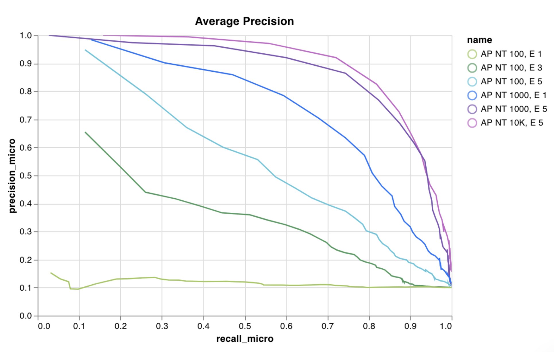 자세한 내용은 [W\&B로 맞춤형 선형 플롯 만들기](https://wandb.ai/wandb/plots/reports/Custom-Line-Plots--VmlldzoyNjk5NTA) 리포트를 참조하세요.
[코드 실행](https://tiny.cc/custom-charts)
임의의 x축과 y축에 대한 점 (x, y) 목록으로 맞춤형 산점도를 로깅합니다.
```python theme={null}
import wandb
with wandb.init() as run:
data = [[x, y] for (x, y) in zip(class_x_scores, class_y_scores)]
table = wandb.Table(data=data, columns=["class_x", "class_y"])
run.log({"my_custom_id": wandb.plot.scatter(table, "class_x", "class_y")})
```
임의의 두 차원에 대한 산점도를 로깅하는 데 이것을 사용할 수 있습니다. 두 값 목록을 서로 대응시켜 플로팅하는 경우에는 각 목록의 값 개수가 정확히 일치해야 합니다. 예를 들어, 각 점에는 x와 y가 모두 있어야 합니다.
자세한 내용은 [W\&B로 맞춤형 선형 플롯 만들기](https://wandb.ai/wandb/plots/reports/Custom-Line-Plots--VmlldzoyNjk5NTA) 리포트를 참조하세요.
[코드 실행](https://tiny.cc/custom-charts)
임의의 x축과 y축에 대한 점 (x, y) 목록으로 맞춤형 산점도를 로깅합니다.
```python theme={null}
import wandb
with wandb.init() as run:
data = [[x, y] for (x, y) in zip(class_x_scores, class_y_scores)]
table = wandb.Table(data=data, columns=["class_x", "class_y"])
run.log({"my_custom_id": wandb.plot.scatter(table, "class_x", "class_y")})
```
임의의 두 차원에 대한 산점도를 로깅하는 데 이것을 사용할 수 있습니다. 두 값 목록을 서로 대응시켜 플로팅하는 경우에는 각 목록의 값 개수가 정확히 일치해야 합니다. 예를 들어, 각 점에는 x와 y가 모두 있어야 합니다.
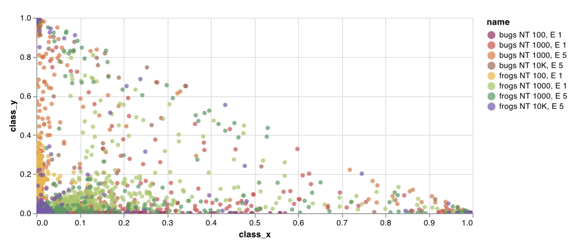 자세한 내용은 [Creating Custom Scatter Plots With W\&B](https://wandb.ai/wandb/plots/reports/Custom-Scatter-Plots--VmlldzoyNjk5NDQ) 리포트를 참조하세요.
[코드 실행](https://tiny.cc/custom-charts)
몇 줄만으로 기본 기능을 사용해 맞춤형 막대 차트(레이블이 지정된 값 목록을 막대로 표시)를 기록할 수 있습니다:
```python theme={null}
import wandb
with wandb.init() as run:
data = [[label, val] for (label, val) in zip(labels, values)]
table = wandb.Table(data=data, columns=["label", "value"])
run.log(
{
"my_bar_chart_id": wandb.plot.bar(
table, "label", "value", title="Custom bar chart"
)
}
)
```
이를 사용해 임의의 막대 차트를 로깅할 수 있습니다. 레이블 목록과 값 목록의 항목 수는 정확히 일치해야 합니다. 각 데이터 포인트에는 레이블과 값이 모두 있어야 합니다.
자세한 내용은 [Creating Custom Scatter Plots With W\&B](https://wandb.ai/wandb/plots/reports/Custom-Scatter-Plots--VmlldzoyNjk5NDQ) 리포트를 참조하세요.
[코드 실행](https://tiny.cc/custom-charts)
몇 줄만으로 기본 기능을 사용해 맞춤형 막대 차트(레이블이 지정된 값 목록을 막대로 표시)를 기록할 수 있습니다:
```python theme={null}
import wandb
with wandb.init() as run:
data = [[label, val] for (label, val) in zip(labels, values)]
table = wandb.Table(data=data, columns=["label", "value"])
run.log(
{
"my_bar_chart_id": wandb.plot.bar(
table, "label", "value", title="Custom bar chart"
)
}
)
```
이를 사용해 임의의 막대 차트를 로깅할 수 있습니다. 레이블 목록과 값 목록의 항목 수는 정확히 일치해야 합니다. 각 데이터 포인트에는 레이블과 값이 모두 있어야 합니다.
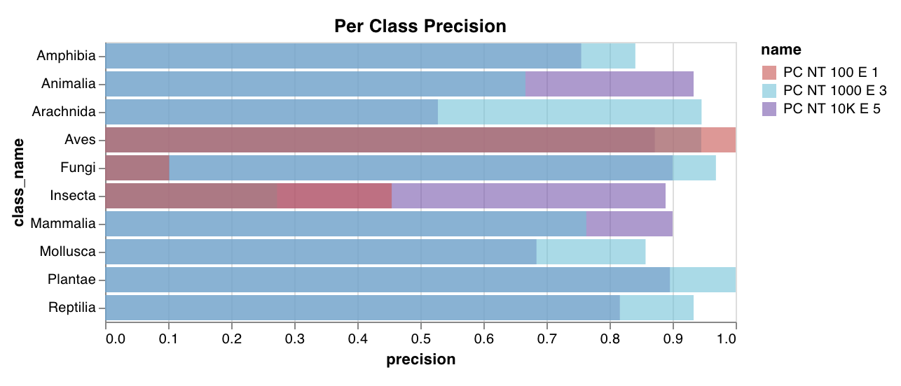 자세한 내용은 [Custom Bar Charts](https://wandb.ai/wandb/plots/reports/Custom-Bar-Charts--VmlldzoyNzExNzk) 리포트를 참조하세요.
[코드 실행](https://tiny.cc/custom-charts)
몇 줄의 코드만으로 맞춤형 히스토그램(값 목록을 개수 또는 발생 빈도에 따라 구간으로 나눈 것)을 기본 기능으로 로그할 수 있습니다. 예측 신뢰도 점수 목록(`scores`)이 있다면, 다음과 같이 분포를 시각화할 수 있습니다:
```python theme={null}
import wandb
with wandb.init() as run:
data = [[s] for s in scores]
table = wandb.Table(data=data, columns=["scores"])
run.log({"my_histogram": wandb.plot.histogram(table, "scores", title="Histogram")})
```
이를 사용해 임의의 히스토그램을 로깅할 수 있습니다. `data`는 리스트의 리스트이며, 행과 열로 구성된 2D 배열을 지원하기 위한 형식입니다.
자세한 내용은 [Custom Bar Charts](https://wandb.ai/wandb/plots/reports/Custom-Bar-Charts--VmlldzoyNzExNzk) 리포트를 참조하세요.
[코드 실행](https://tiny.cc/custom-charts)
몇 줄의 코드만으로 맞춤형 히스토그램(값 목록을 개수 또는 발생 빈도에 따라 구간으로 나눈 것)을 기본 기능으로 로그할 수 있습니다. 예측 신뢰도 점수 목록(`scores`)이 있다면, 다음과 같이 분포를 시각화할 수 있습니다:
```python theme={null}
import wandb
with wandb.init() as run:
data = [[s] for s in scores]
table = wandb.Table(data=data, columns=["scores"])
run.log({"my_histogram": wandb.plot.histogram(table, "scores", title="Histogram")})
```
이를 사용해 임의의 히스토그램을 로깅할 수 있습니다. `data`는 리스트의 리스트이며, 행과 열로 구성된 2D 배열을 지원하기 위한 형식입니다.
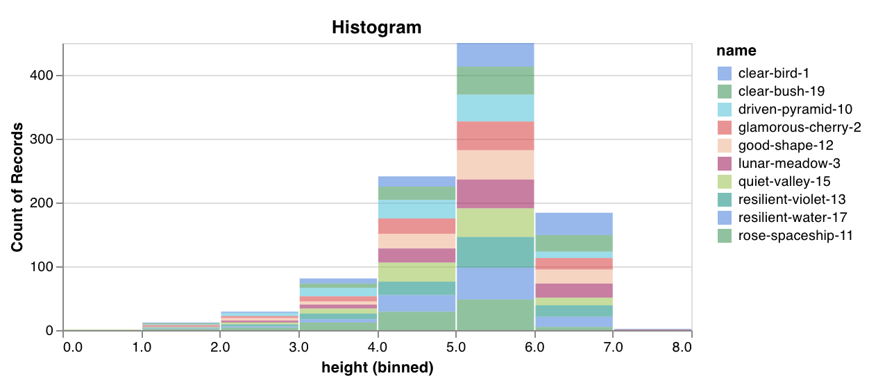 자세한 내용은 [W\&B로 맞춤형 히스토그램 만들기](https://wandb.ai/wandb/plots/reports/Custom-Histograms--VmlldzoyNzE0NzM) 리포트를 참조하세요.
[코드 실행하기](https://tiny.cc/custom-charts)
하나의 공통 x-y 축에 여러 선 또는 서로 다른 여러 x-y 좌표 쌍 목록을 플롯합니다:
```python theme={null}
import wandb
with wandb.init() as run:
run.log(
{
"my_custom_id": wandb.plot.line_series(
xs=[0, 1, 2, 3, 4],
ys=[[10, 20, 30, 40, 50], [0.5, 11, 72, 3, 41]],
keys=["metric Y", "metric Z"],
title="Two Random Metrics",
xname="x units",
)
}
)
```
x 및 y 포인트 수는 정확히 일치해야 합니다. 하나의 x 값 목록을 여러 y 값 목록에 대응시킬 수도 있고, 각 y 값 목록마다 별도의 x 값 목록을 제공할 수도 있습니다.
자세한 내용은 [W\&B로 맞춤형 히스토그램 만들기](https://wandb.ai/wandb/plots/reports/Custom-Histograms--VmlldzoyNzE0NzM) 리포트를 참조하세요.
[코드 실행하기](https://tiny.cc/custom-charts)
하나의 공통 x-y 축에 여러 선 또는 서로 다른 여러 x-y 좌표 쌍 목록을 플롯합니다:
```python theme={null}
import wandb
with wandb.init() as run:
run.log(
{
"my_custom_id": wandb.plot.line_series(
xs=[0, 1, 2, 3, 4],
ys=[[10, 20, 30, 40, 50], [0.5, 11, 72, 3, 41]],
keys=["metric Y", "metric Z"],
title="Two Random Metrics",
xname="x units",
)
}
)
```
x 및 y 포인트 수는 정확히 일치해야 합니다. 하나의 x 값 목록을 여러 y 값 목록에 대응시킬 수도 있고, 각 y 값 목록마다 별도의 x 값 목록을 제공할 수도 있습니다.
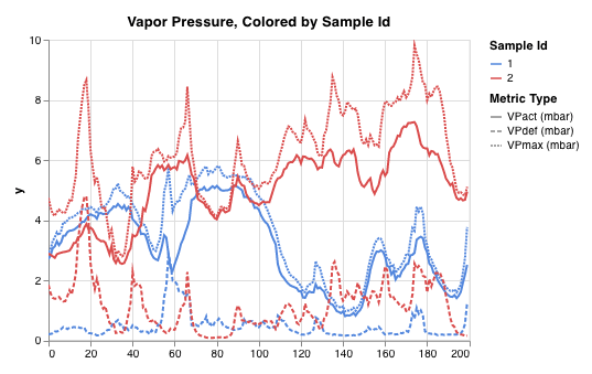 자세한 내용은 [맞춤형 다중 선 플롯](https://wandb.ai/wandb/plots/reports/Custom-Multi-Line-Plots--VmlldzozOTMwMjU) 리포트를 참조하세요.
### 모델 평가 차트
이 사전 설정 차트에는 `wandb.plot()` 메서드가 기본 제공되어, 스크립트에서 바로 차트를 로깅하고 UI에서 원하는 정확한 정보를 빠르게 확인할 수 있습니다.
한 줄로 [정밀도-재현율 곡선](https://scikit-learn.org/stable/modules/generated/sklearn.metrics.precision_recall_curve.html#sklearn.metrics.precision_recall_curve)을 생성하세요:
```python theme={null}
import wandb
with wandb.init() as run:
# ground_truth는 정답 레이블 목록이고, predictions는 예측 점수 목록입니다.
# 예를 들어 ground_truth = [0, 1, 1, 0], predictions = [0.1, 0.4, 0.35, 0.8]입니다.
ground_truth = [0, 1, 1, 0]
predictions = [0.1, 0.4, 0.35, 0.8]
run.log({"pr": wandb.plot.pr_curve(ground_truth, predictions)})
```
코드가 다음 항목에 액세스할 수 있을 때마다 이를 기록할 수 있습니다:
* 예제 집합에 대한 모델의 예측 점수(`predictions`).
* 해당 예제에 대한 정답 레이블(`ground_truth`).
* (선택) 레이블 또는 클래스 이름의 목록. 예를 들어 레이블 인덱스 0이 cat, 1이 dog, 2가 bird를 의미한다면 `labels=["cat", "dog", "bird"]`.
* (선택) 플롯에 시각화할 레이블의 하위 집합(여전히 목록 형식).
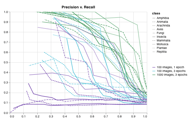 자세한 내용은 [W\&B로 정밀도-재현율 곡선 그리기](https://wandb.ai/wandb/plots/reports/Plot-Precision-Recall-Curves--VmlldzoyNjk1ODY) 리포트를 참조하세요.
[코드 실행](https://colab.research.google.com/drive/1mS8ogA3LcZWOXchfJoMrboW3opY1A8BY?usp=sharing)
한 줄로 [ROC 곡선](https://scikit-learn.org/stable/modules/generated/sklearn.metrics.roc_curve.html#sklearn.metrics.roc_curve)을 생성하세요:
```python theme={null}
import wandb
with wandb.init() as run:
# ground_truth는 실제 레이블들의 목록이고, predictions는 예측된 점수들의 목록입니다.
# 예를 들어 ground_truth = [0, 1, 1, 0], predictions = [0.1, 0.4, 0.35, 0.8]입니다.
ground_truth = [0, 1, 1, 0]
predictions = [0.1, 0.4, 0.35, 0.8]
run.log({"roc": wandb.plot.roc_curve(ground_truth, predictions)})
```
코드에서 다음 항목에 접근할 수 있을 때마다 이를 기록할 수 있습니다.
* 예제 집합에 대한 모델의 예측 점수(`predictions`)
* 해당 예제의 정답 레이블(`ground_truth`)
* (선택) 레이블 또는 클래스 이름의 목록. 예를 들어 레이블 인덱스 0이 cat, 1이 dog, 2가 bird를 의미한다면 `labels=["cat", "dog", "bird"]`
* (선택) 플롯에 시각화할 레이블의 일부 하위 집합(목록 형식 유지)
자세한 내용은 [W\&B로 정밀도-재현율 곡선 그리기](https://wandb.ai/wandb/plots/reports/Plot-Precision-Recall-Curves--VmlldzoyNjk1ODY) 리포트를 참조하세요.
[코드 실행](https://colab.research.google.com/drive/1mS8ogA3LcZWOXchfJoMrboW3opY1A8BY?usp=sharing)
한 줄로 [ROC 곡선](https://scikit-learn.org/stable/modules/generated/sklearn.metrics.roc_curve.html#sklearn.metrics.roc_curve)을 생성하세요:
```python theme={null}
import wandb
with wandb.init() as run:
# ground_truth는 실제 레이블들의 목록이고, predictions는 예측된 점수들의 목록입니다.
# 예를 들어 ground_truth = [0, 1, 1, 0], predictions = [0.1, 0.4, 0.35, 0.8]입니다.
ground_truth = [0, 1, 1, 0]
predictions = [0.1, 0.4, 0.35, 0.8]
run.log({"roc": wandb.plot.roc_curve(ground_truth, predictions)})
```
코드에서 다음 항목에 접근할 수 있을 때마다 이를 기록할 수 있습니다.
* 예제 집합에 대한 모델의 예측 점수(`predictions`)
* 해당 예제의 정답 레이블(`ground_truth`)
* (선택) 레이블 또는 클래스 이름의 목록. 예를 들어 레이블 인덱스 0이 cat, 1이 dog, 2가 bird를 의미한다면 `labels=["cat", "dog", "bird"]`
* (선택) 플롯에 시각화할 레이블의 일부 하위 집합(목록 형식 유지)
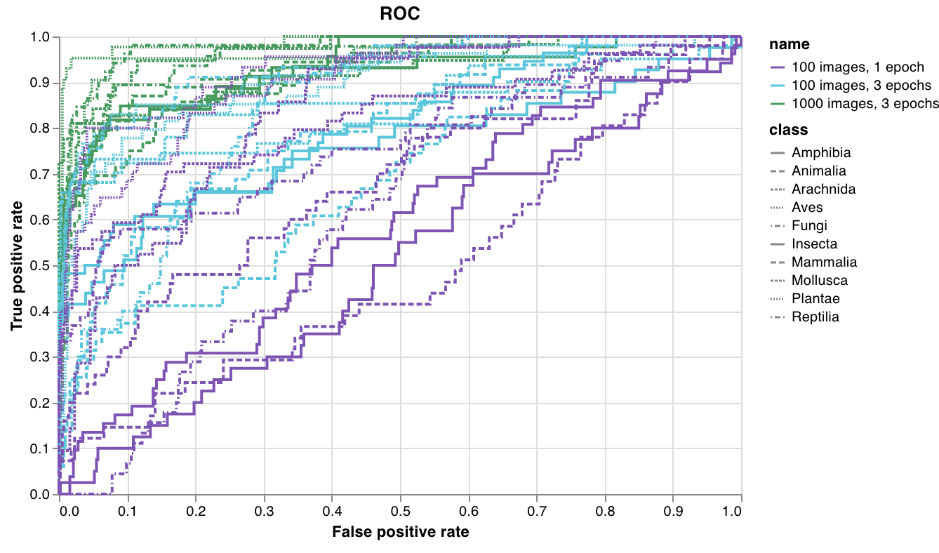 자세한 내용은 [Plot ROC Curves With W\&B](https://wandb.ai/wandb/plots/reports/Plot-ROC-Curves--VmlldzoyNjk3MDE) Reports를 참조하세요.
[코드 실행하기](https://colab.research.google.com/github/wandb/examples/blob/master/colabs/wandb-log/Plot_ROC_Curves_with_W%26B.ipynb)
한 줄 코드로 다중 클래스 [혼동 행렬](https://scikit-learn.org/stable/auto_examples/model_selection/plot_confusion_matrix.html)을 만드세요:
```python theme={null}
import wandb
cm = wandb.plot.confusion_matrix(
y_true=ground_truth, preds=predictions, class_names=class_names
)
with wandb.init() as run:
run.log({"conf_mat": cm})
```
코드에서 다음 항목에 접근할 수 있다면 어디서든 이를 기록할 수 있습니다.
* 예제 집합에 대한 모델의 예측 레이블(`preds`) 또는 정규화된 확률 점수(`probs`). 확률의 shape은 (예제 수, 클래스 수)여야 합니다. 확률 또는 예측 중 하나만 제공할 수 있으며, 둘 다 제공할 수는 없습니다.
* 해당 예제에 대응하는 정답 레이블(`y_true`).
* `class_names`에 문자열로 된 레이블 또는 클래스 이름의 전체 목록. 예를 들어 인덱스 0이 `cat`, 1이 `dog`, 2가 `bird`이면 `class_names=["cat", "dog", "bird"]`입니다.
자세한 내용은 [Plot ROC Curves With W\&B](https://wandb.ai/wandb/plots/reports/Plot-ROC-Curves--VmlldzoyNjk3MDE) Reports를 참조하세요.
[코드 실행하기](https://colab.research.google.com/github/wandb/examples/blob/master/colabs/wandb-log/Plot_ROC_Curves_with_W%26B.ipynb)
한 줄 코드로 다중 클래스 [혼동 행렬](https://scikit-learn.org/stable/auto_examples/model_selection/plot_confusion_matrix.html)을 만드세요:
```python theme={null}
import wandb
cm = wandb.plot.confusion_matrix(
y_true=ground_truth, preds=predictions, class_names=class_names
)
with wandb.init() as run:
run.log({"conf_mat": cm})
```
코드에서 다음 항목에 접근할 수 있다면 어디서든 이를 기록할 수 있습니다.
* 예제 집합에 대한 모델의 예측 레이블(`preds`) 또는 정규화된 확률 점수(`probs`). 확률의 shape은 (예제 수, 클래스 수)여야 합니다. 확률 또는 예측 중 하나만 제공할 수 있으며, 둘 다 제공할 수는 없습니다.
* 해당 예제에 대응하는 정답 레이블(`y_true`).
* `class_names`에 문자열로 된 레이블 또는 클래스 이름의 전체 목록. 예를 들어 인덱스 0이 `cat`, 1이 `dog`, 2가 `bird`이면 `class_names=["cat", "dog", "bird"]`입니다.
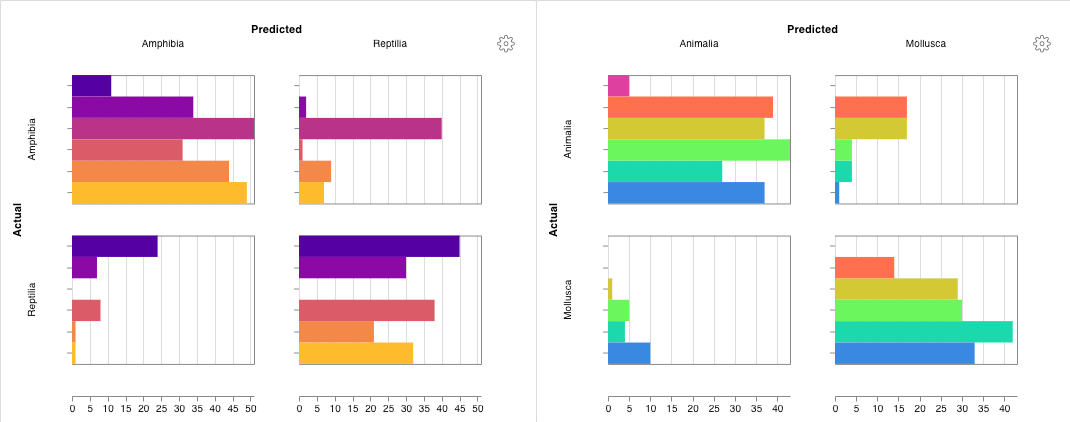 자세한 내용은 [혼동 행렬: 사용 및 예제](https://wandb.ai/wandb/plots/reports/Confusion-Matrix--VmlldzozMDg1NTM) 리포트를 참조하세요.
[코드 실행하기](https://colab.research.google.com/github/wandb/examples/blob/master/colabs/wandb-log/Log_a_Confusion_Matrix_with_W%26B.ipynb)
자세한 내용은 [혼동 행렬: 사용 및 예제](https://wandb.ai/wandb/plots/reports/Confusion-Matrix--VmlldzozMDg1NTM) 리포트를 참조하세요.
[코드 실행하기](https://colab.research.google.com/github/wandb/examples/blob/master/colabs/wandb-log/Log_a_Confusion_Matrix_with_W%26B.ipynb)
### 대화형 맞춤형 차트
전체적으로 맞춤 설정하려면 기본 제공 [맞춤형 차트 사전 설정](/ko/models/app/features/custom-charts/walkthrough/)을 조정하거나 새 사전 설정을 만든 다음 차트를 저장하세요. 차트 ID를 사용해 스크립트에서 바로 해당 맞춤형 사전 설정에 데이터를 로깅할 수 있습니다.
```python theme={null}
import wandb
# 플롯할 열이 포함된 테이블을 만듭니다.
table = wandb.Table(data=data, columns=["step", "height"])
# 테이블의 열을 차트의 필드에 매핑합니다.
fields = {"x": "step", "value": "height"}
# 테이블을 사용하여 새 맞춤형 차트 사전 설정을 채웁니다.
# 저장된 차트 사전 설정을 사용하려면 vega_spec_name을 변경하세요.
# 제목을 수정하려면 string_fields를 변경하세요.
my_custom_chart = wandb.plot_table(
vega_spec_name="carey/new_chart",
data_table=table,
fields=fields,
string_fields={"title": "Height Histogram"},
)
with wandb.init() as run:
# 맞춤형 차트를 로깅합니다.
run.log({"my_custom_chart": my_custom_chart})
```
[코드를 실행해 보세요](https://tiny.cc/custom-charts)
### Matplotlib 및 Plotly 플롯
`wandb.plot()`으로 W\&B [맞춤형 차트](/ko/models/app/features/custom-charts/walkthrough/)를 사용하는 대신, [matplotlib](https://matplotlib.org/)와 [Plotly](https://plotly.com/)로 생성한 차트를 로깅할 수 있습니다.
```python theme={null}
import wandb
import matplotlib.pyplot as plt
with wandb.init() as run:
# 단순한 matplotlib 플롯을 생성합니다.
plt.figure()
plt.plot([1, 2, 3, 4])
plt.ylabel("some interesting numbers")
# 플롯을 W&B에 로깅합니다.
run.log({"chart": plt})
```
`matplotlib` 플롯 또는 figure 객체를 `wandb.Run.log()`에 전달하기만 하면 됩니다. 기본적으로는 플롯을 [Plotly](https://plot.ly/) 플롯으로 변환합니다. 플롯을 이미지로 로깅하려면 `wandb.Image`에 플롯을 전달하면 됩니다. Plotly 차트도 직접 지원합니다.
"You attempted to log an empty plot"와 같은 오류가 발생하면, `fig = plt.figure()`로 figure를 플롯과 별도로 저장한 다음 `wandb.Run.log()`를 호출할 때 `fig`를 로깅하세요.
### W\&B Tables에 맞춤형 HTML 로깅하기
W\&B에서는 Plotly와 Bokeh의 대화형 차트를 HTML로 로깅해 Tables에 추가할 수 있습니다.
#### Plotly figure를 HTML로 변환해 Tables에 로깅하기
Plotly 차트를 HTML로 변환하면 대화형 차트를 W\&B Tables에 로깅할 수 있습니다.
```python theme={null}
import wandb
import plotly.express as px
# 새 run을 초기화합니다.
with wandb.init(project="log-plotly-fig-tables", name="plotly_html") as run:
# 테이블을 생성합니다.
table = wandb.Table(columns=["plotly_figure"])
# Plotly figure의 경로를 생성합니다.
path_to_plotly_html = "./plotly_figure.html"
# Plotly figure 예시.
fig = px.scatter(x=[0, 1, 2, 3, 4], y=[0, 1, 4, 9, 16])
# Plotly figure를 HTML로 저장합니다.
# auto_play를 False로 설정하면 애니메이션 Plotly 차트가
# 테이블에서 자동으로 재생되지 않습니다.
fig.write_html(path_to_plotly_html, auto_play=False)
# Plotly figure를 HTML 파일로 Table에 추가합니다.
table.add_data(wandb.Html(path_to_plotly_html))
# 테이블을 로깅합니다.
run.log({"test_table": table})
```
#### Bokeh figure를 HTML로 변환해 Tables에 로깅하기
대화형 Bokeh 차트를 HTML로 변환하면 W\&B Tables에 로깅할 수 있습니다.
```python theme={null}
from scipy.signal import spectrogram
import holoviews as hv
import panel as pn
from scipy.io import wavfile
import numpy as np
from bokeh.resources import INLINE
hv.extension("bokeh", logo=False)
import wandb
def save_audio_with_bokeh_plot_to_html(audio_path, html_file_name):
sr, wav_data = wavfile.read(audio_path)
duration = len(wav_data) / sr
f, t, sxx = spectrogram(wav_data, sr)
spec_gram = hv.Image((t, f, np.log10(sxx)), ["Time (s)", "Frequency (hz)"]).opts(
width=500, height=150, labelled=[]
)
audio = pn.pane.Audio(wav_data, sample_rate=sr, name="Audio", throttle=500)
slider = pn.widgets.FloatSlider(end=duration, visible=False)
line = hv.VLine(0).opts(color="white")
slider.jslink(audio, value="time", bidirectional=True)
slider.jslink(line, value="glyph.location")
combined = pn.Row(audio, spec_gram * line, slider).save(html_file_name)
html_file_name = "audio_with_plot.html"
audio_path = "hello.wav"
save_audio_with_bokeh_plot_to_html(audio_path, html_file_name)
wandb_html = wandb.Html(html_file_name)
with wandb.init(project="audio_test") as run:
my_table = wandb.Table(columns=["audio_with_plot"], data=[[wandb_html]])
run.log({"audio_table": my_table})
```