> ## Documentation Index
> Fetch the complete documentation index at: https://wb-21fd5541-dbrian-docs-serverless-training-quickstart.mintlify.site/llms.txt
> Use this file to discover all available pages before exploring further.
# 맞춤형 차트 Overview
> Vega 시각화로 W&B 프로젝트에서 맞춤형 차트를 만드세요
맞춤형 차트를 사용하면 W\&B가 제공하는 기본값을 넘어, 로깅된 데이터를 원하는 방식으로 정확하게 시각화할 수 있습니다. 정밀도-재현율 곡선, 맞춤형 히스토그램, 여러 Experiments 오버레이처럼 기본 제공 패널에서 지원하지 않는 관계, 분포 또는 모델 평가 메트릭을 플롯해야 할 때 유용합니다.
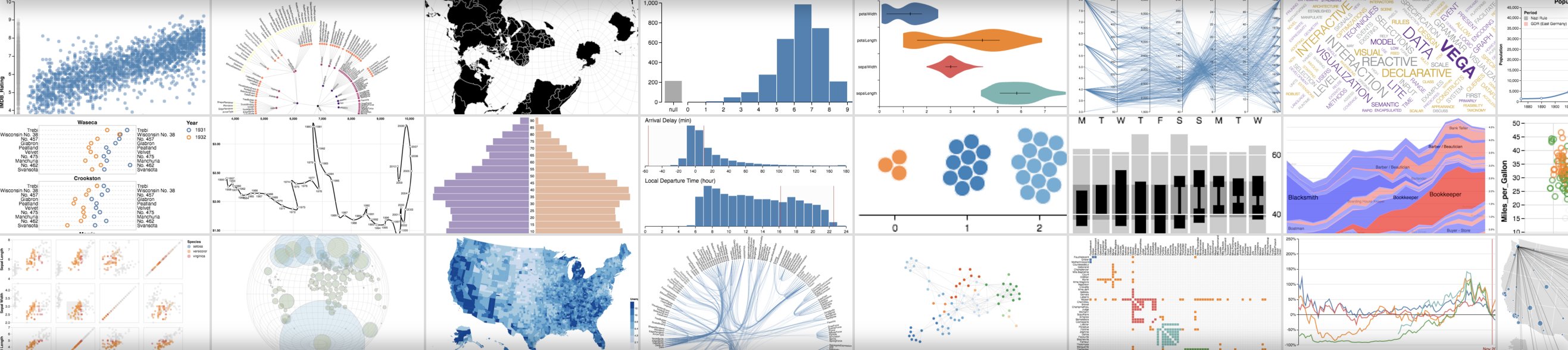
W\&B 프로젝트에서 맞춤형 차트를 만드세요. 임의의 데이터 테이블을 로깅하고 원하는 형태로 정확하게 시각화하세요. [Vega](https://vega.github.io/vega/)를 사용해 글꼴, 색상, 툴팁의 세부 사항까지 제어할 수 있습니다.
* Code: 예제 [Colab 노트북](https://tiny.cc/custom-charts)을 사용해 보세요.
* Video: [워크스루 비디오](https://www.youtube.com/watch?v=3-N9OV6bkSM)를 시청하세요.
* Example: 빠르게 살펴보는 Keras 및 Sklearn [데모 노트북](https://colab.research.google.com/drive/1g-gNGokPWM2Qbc8p1Gofud0_5AoZdoSD?usp=sharing).
## 작동 방식
1. **데이터 로깅**: 스크립트에서 [설정](/ko/models/track/config/) 및 summary 데이터를 로깅합니다.
2. **차트 사용자 지정**: [GraphQL](https://graphql.org) 쿼리로 로깅된 데이터를 가져옵니다. 시각화 문법인 [Vega](https://vega.github.io/vega/)를 사용해 쿼리 결과를 시각화합니다.
3. **차트 로깅**: 스크립트에서 `wandb.plot_table()`을 사용해 자체 프리셋을 호출합니다.
 예상한 데이터가 보이지 않으면, 찾는 열이 선택한 run에 로깅되지 않았을 수 있습니다. 차트를 저장한 다음 Runs table로 돌아가 **eye** 아이콘을 사용해 선택한 run을 확인하세요.
## 스크립트에서 차트 로깅하기
다음 섹션에서는 트레이닝 스크립트에서 직접 차트를 로깅하는 두 가지 방법을 설명합니다. 하나는 일반적으로 사용하는 시각화를 지원하는 기본 제공 차트 프리셋이고, 다른 하나는 자체 Vega 사양을 재사용할 수 있도록 하는 맞춤형 프리셋입니다.
### 기본 제공 프리셋
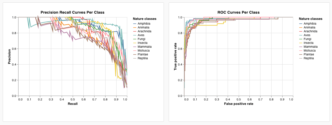
W\&B에는 스크립트에서 바로 로깅할 수 있는 기본 제공 차트 프리셋이 여러 가지 있습니다. 여기에는 선형 플롯, 산점도, 막대 차트, 히스토그램, PR 곡선, ROC 곡선이 포함됩니다.
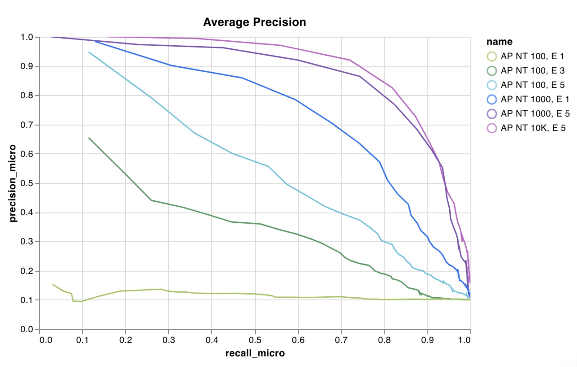
`wandb.plot.line()`
맞춤형 선형 플롯을 기록합니다. 임의의 x축과 y축에서 (x, y) 점들을 순서대로 연결한 목록입니다.
```python theme={null}
with wandb.init() as run:
data = [[x, y] for (x, y) in zip(x_values, y_values)]
table = wandb.Table(data=data, columns=["x", "y"])
run.log(
{
"my_custom_plot_id": wandb.plot.line(
table, "x", "y", title="Custom Y vs X Line Plot"
)
}
)
```
선형 플롯은 임의의 두 차원에 걸친 곡선을 기록합니다. 두 개의 값 목록을 서로 대응시켜 플롯할 경우, 각 목록의 값 개수는 정확히 일치해야 합니다(예를 들어 각 점에는 x와 y가 모두 있어야 합니다).
 [예제 리포트 보기](https://wandb.ai/wandb/plots/reports/Custom-Line-Plots--VmlldzoyNjk5NTA) 또는 [예제 Google Colab 노트북 사용해 보기](https://tiny.cc/custom-charts).
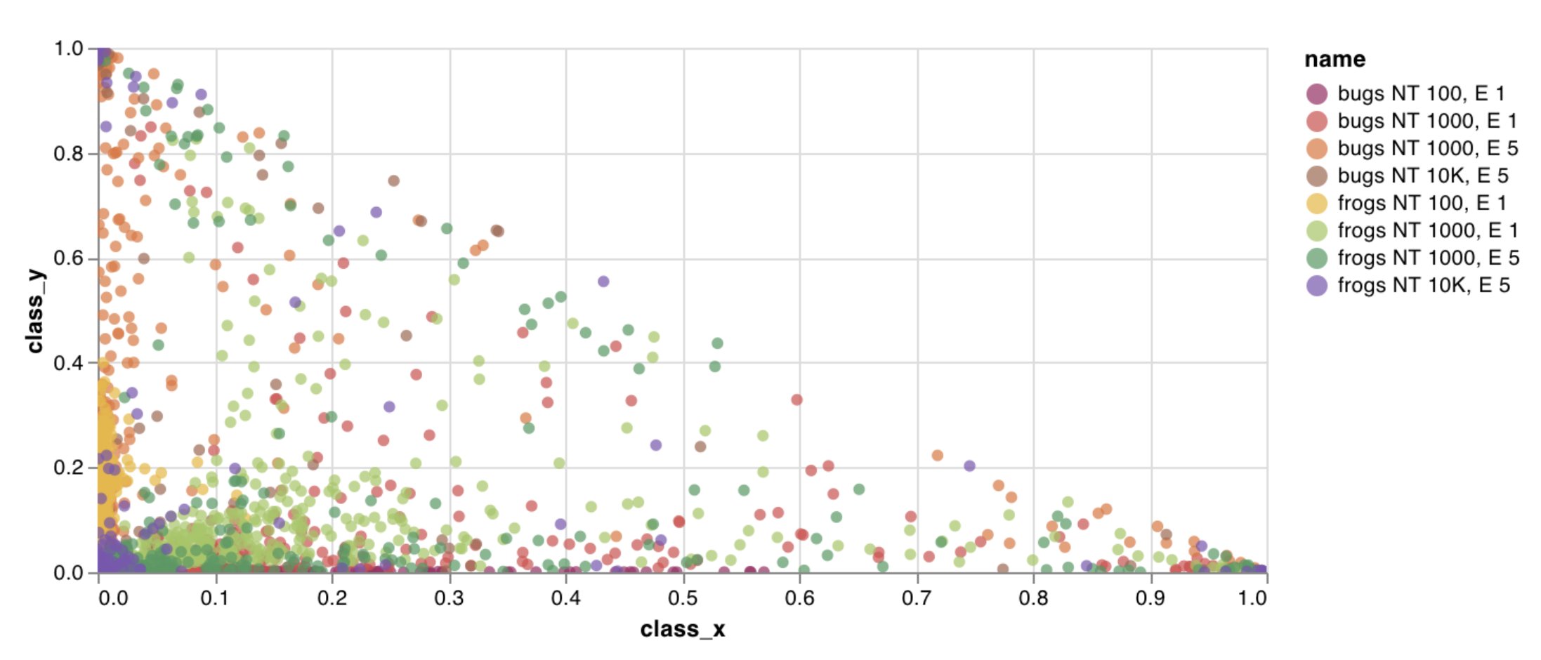
`wandb.plot.scatter()`
임의의 두 축 x와 y 위의 점 (x, y) 목록으로 이루어진 맞춤형 산점도를 기록합니다.
```python theme={null}
with wandb.init() as run:
data = [[x, y] for (x, y) in zip(class_x_prediction_scores, class_y_prediction_scores)]
table = wandb.Table(data=data, columns=["class_x", "class_y"])
run.log({"my_custom_id": wandb.plot.scatter(table, "class_x", "class_y")})
```
이 기능을 사용해 임의의 두 차원에 산점도 점을 기록할 수 있습니다. 두 값 목록을 서로 대응해 그리는 경우에는 각 목록의 값 개수가 정확히 일치해야 합니다(예를 들어 각 점에는 x와 y가 모두 있어야 합니다).
[예제 리포트 보기](https://wandb.ai/wandb/plots/reports/Custom-Line-Plots--VmlldzoyNjk5NTA) 또는 [예제 Google Colab 노트북 사용해 보기](https://tiny.cc/custom-charts).
`wandb.plot.scatter()`
임의의 두 축 x와 y 위의 점 (x, y) 목록으로 이루어진 맞춤형 산점도를 기록합니다.
```python theme={null}
with wandb.init() as run:
data = [[x, y] for (x, y) in zip(class_x_prediction_scores, class_y_prediction_scores)]
table = wandb.Table(data=data, columns=["class_x", "class_y"])
run.log({"my_custom_id": wandb.plot.scatter(table, "class_x", "class_y")})
```
이 기능을 사용해 임의의 두 차원에 산점도 점을 기록할 수 있습니다. 두 값 목록을 서로 대응해 그리는 경우에는 각 목록의 값 개수가 정확히 일치해야 합니다(예를 들어 각 점에는 x와 y가 모두 있어야 합니다).
 [예시 Reports 참조](https://wandb.ai/wandb/plots/reports/Custom-Scatter-Plots--VmlldzoyNjk5NDQ) 또는 [예시 Google Colab 노트북 사용해 보기](https://tiny.cc/custom-charts).
`wandb.plot.bar()`
레이블이 지정된 값 목록을 막대로 나타내는 맞춤형 막대 차트를 기록합니다:
```python theme={null}
with wandb.init() as run:
data = [[label, val] for (label, val) in zip(labels, values)]
table = wandb.Table(data=data, columns=["label", "value"])
run.log(
{
"my_bar_chart_id": wandb.plot.bar(
table, "label", "value", title="Custom Bar Chart"
)
}
)
```
임의의 막대 차트를 로깅하는 데 이 기능을 사용할 수 있습니다. 리스트의 레이블 개수와 값 개수는 정확히 일치해야 합니다(예를 들어 각 데이터 포인트에는 레이블과 값이 모두 있어야 합니다).
[예시 Reports 참조](https://wandb.ai/wandb/plots/reports/Custom-Scatter-Plots--VmlldzoyNjk5NDQ) 또는 [예시 Google Colab 노트북 사용해 보기](https://tiny.cc/custom-charts).
`wandb.plot.bar()`
레이블이 지정된 값 목록을 막대로 나타내는 맞춤형 막대 차트를 기록합니다:
```python theme={null}
with wandb.init() as run:
data = [[label, val] for (label, val) in zip(labels, values)]
table = wandb.Table(data=data, columns=["label", "value"])
run.log(
{
"my_bar_chart_id": wandb.plot.bar(
table, "label", "value", title="Custom Bar Chart"
)
}
)
```
임의의 막대 차트를 로깅하는 데 이 기능을 사용할 수 있습니다. 리스트의 레이블 개수와 값 개수는 정확히 일치해야 합니다(예를 들어 각 데이터 포인트에는 레이블과 값이 모두 있어야 합니다).
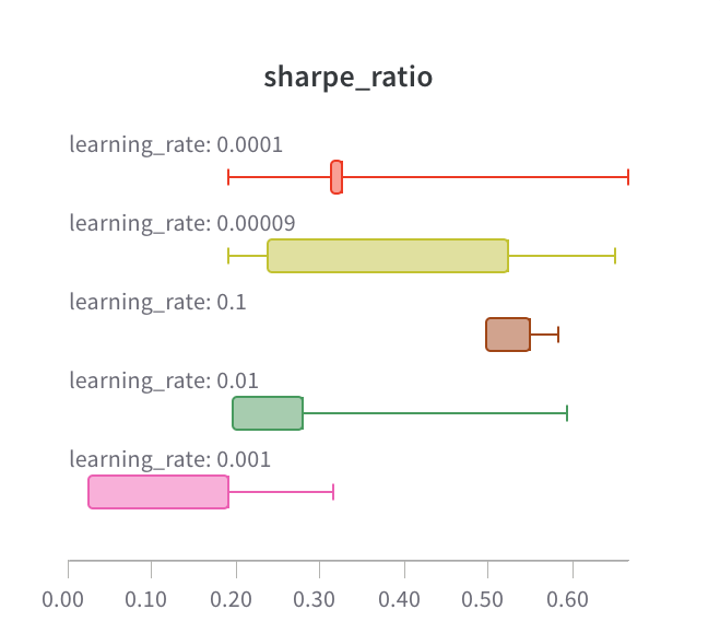 [예제 리포트 보기](https://wandb.ai/wandb/plots/reports/Custom-Bar-Charts--VmlldzoyNzExNzk) 또는 [예제 Google Colab 노트북 사용해 보기](https://tiny.cc/custom-charts).
`wandb.plot.histogram()`
맞춤형 히스토그램을 기록합니다(값 목록을 발생 횟수 또는 발생 빈도에 따라 bins로 분류). 예를 들어, 예측 신뢰도 점수 목록(`scores`)이 있고 그 분포를 시각화하려는 경우를 가정해 보겠습니다:
```python theme={null}
with wandb.init() as run:
data = [[s] for s in scores]
table = wandb.Table(data=data, columns=["scores"])
run.log({"my_histogram": wandb.plot.histogram(table, "scores", title=None)})
```
임의의 히스토그램을 로깅하는 데 사용할 수 있습니다. `data`는 목록의 목록이며, 행과 열로 구성된 2D 배열을 지원하기 위한 형식입니다.
[예제 리포트 보기](https://wandb.ai/wandb/plots/reports/Custom-Bar-Charts--VmlldzoyNzExNzk) 또는 [예제 Google Colab 노트북 사용해 보기](https://tiny.cc/custom-charts).
`wandb.plot.histogram()`
맞춤형 히스토그램을 기록합니다(값 목록을 발생 횟수 또는 발생 빈도에 따라 bins로 분류). 예를 들어, 예측 신뢰도 점수 목록(`scores`)이 있고 그 분포를 시각화하려는 경우를 가정해 보겠습니다:
```python theme={null}
with wandb.init() as run:
data = [[s] for s in scores]
table = wandb.Table(data=data, columns=["scores"])
run.log({"my_histogram": wandb.plot.histogram(table, "scores", title=None)})
```
임의의 히스토그램을 로깅하는 데 사용할 수 있습니다. `data`는 목록의 목록이며, 행과 열로 구성된 2D 배열을 지원하기 위한 형식입니다.
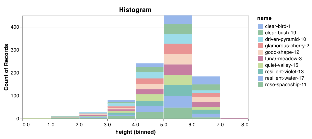 [예시 리포트 보기](https://wandb.ai/wandb/plots/reports/Custom-Histograms--VmlldzoyNzE0NzM) 또는 [예시 Google Colab 노트북 사용해 보기](https://tiny.cc/custom-charts).
`wandb.plot.pr_curve()`
한 줄로 [정밀도-재현율 곡선](https://scikit-learn.org/stable/modules/generated/sklearn.metrics.precision_recall_curve.html#sklearn.metrics.precision_recall_curve)을 생성하세요:
```python theme={null}
with wandb.init() as run:
plot = wandb.plot.pr_curve(ground_truth, predictions, labels=None, classes_to_plot=None)
run.log({"pr": plot})
```
코드에서 다음 항목에 액세스할 수 있을 때마다 이를 로그할 수 있습니다.
* 예제 집합에 대한 모델의 예측 점수(`predictions`)
* 해당 예제의 정답 레이블(`ground_truth`)
* `labels` (선택 사항): 레이블/클래스 이름 목록(`labels=["cat", "dog", "bird"...]`에서 레이블 인덱스 0이 cat, 1 = dog, 2 = bird 등을 의미하는 경우)
* `classes_to_plot` (선택 사항): 플롯에 시각화할 레이블의 하위 집합(여전히 목록 형식)
[예시 리포트 보기](https://wandb.ai/wandb/plots/reports/Custom-Histograms--VmlldzoyNzE0NzM) 또는 [예시 Google Colab 노트북 사용해 보기](https://tiny.cc/custom-charts).
`wandb.plot.pr_curve()`
한 줄로 [정밀도-재현율 곡선](https://scikit-learn.org/stable/modules/generated/sklearn.metrics.precision_recall_curve.html#sklearn.metrics.precision_recall_curve)을 생성하세요:
```python theme={null}
with wandb.init() as run:
plot = wandb.plot.pr_curve(ground_truth, predictions, labels=None, classes_to_plot=None)
run.log({"pr": plot})
```
코드에서 다음 항목에 액세스할 수 있을 때마다 이를 로그할 수 있습니다.
* 예제 집합에 대한 모델의 예측 점수(`predictions`)
* 해당 예제의 정답 레이블(`ground_truth`)
* `labels` (선택 사항): 레이블/클래스 이름 목록(`labels=["cat", "dog", "bird"...]`에서 레이블 인덱스 0이 cat, 1 = dog, 2 = bird 등을 의미하는 경우)
* `classes_to_plot` (선택 사항): 플롯에 시각화할 레이블의 하위 집합(여전히 목록 형식)
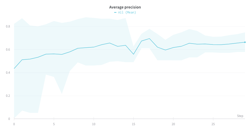 [예제 리포트 참조](https://wandb.ai/wandb/plots/reports/Plot-Precision-Recall-Curves--VmlldzoyNjk1ODY) 또는 [예제 Google Colab 노트북을 사용해 보세요](https://colab.research.google.com/drive/1mS8ogA3LcZWOXchfJoMrboW3opY1A8BY?usp=sharing).
`wandb.plot.roc_curve()`
한 줄로 [ROC 곡선](https://scikit-learn.org/stable/modules/generated/sklearn.metrics.roc_curve.html#sklearn.metrics.roc_curve)을 생성하세요:
```python theme={null}
with wandb.init() as run:
# ground_truth는 정답 레이블의 목록이고, predictions는 예측 점수의 목록입니다
ground_truth = [0, 1, 0, 1, 0, 1]
predictions = [0.1, 0.4, 0.35, 0.8, 0.7, 0.9]
# ROC 곡선 플롯 생성
# labels는 클래스 이름의 선택적 목록이고, classes_to_plot은 시각화할 해당 레이블의 선택적 하위 집합입니다
plot = wandb.plot.roc_curve(
ground_truth, predictions, labels=None, classes_to_plot=None
)
run.log({"roc": plot})
```
코드에서 다음 항목을 사용할 수 있을 때마다 이를 로깅할 수 있습니다.
* 예제 집합에 대한 모델의 예측 점수(`predictions`)
* 해당 예제에 대한 정답 레이블(`ground_truth`)
* `labels` (선택): 레이블 또는 클래스 이름의 목록(`labels=["cat", "dog", "bird"...]`에서 레이블 인덱스 0이 cat, 1 = dog, 2 = bird 등을 의미하는 경우)
* `classes_to_plot` (선택): 플롯에 시각화할 이 레이블들의 하위 집합(여전히 목록 형식)
[예제 리포트 참조](https://wandb.ai/wandb/plots/reports/Plot-Precision-Recall-Curves--VmlldzoyNjk1ODY) 또는 [예제 Google Colab 노트북을 사용해 보세요](https://colab.research.google.com/drive/1mS8ogA3LcZWOXchfJoMrboW3opY1A8BY?usp=sharing).
`wandb.plot.roc_curve()`
한 줄로 [ROC 곡선](https://scikit-learn.org/stable/modules/generated/sklearn.metrics.roc_curve.html#sklearn.metrics.roc_curve)을 생성하세요:
```python theme={null}
with wandb.init() as run:
# ground_truth는 정답 레이블의 목록이고, predictions는 예측 점수의 목록입니다
ground_truth = [0, 1, 0, 1, 0, 1]
predictions = [0.1, 0.4, 0.35, 0.8, 0.7, 0.9]
# ROC 곡선 플롯 생성
# labels는 클래스 이름의 선택적 목록이고, classes_to_plot은 시각화할 해당 레이블의 선택적 하위 집합입니다
plot = wandb.plot.roc_curve(
ground_truth, predictions, labels=None, classes_to_plot=None
)
run.log({"roc": plot})
```
코드에서 다음 항목을 사용할 수 있을 때마다 이를 로깅할 수 있습니다.
* 예제 집합에 대한 모델의 예측 점수(`predictions`)
* 해당 예제에 대한 정답 레이블(`ground_truth`)
* `labels` (선택): 레이블 또는 클래스 이름의 목록(`labels=["cat", "dog", "bird"...]`에서 레이블 인덱스 0이 cat, 1 = dog, 2 = bird 등을 의미하는 경우)
* `classes_to_plot` (선택): 플롯에 시각화할 이 레이블들의 하위 집합(여전히 목록 형식)
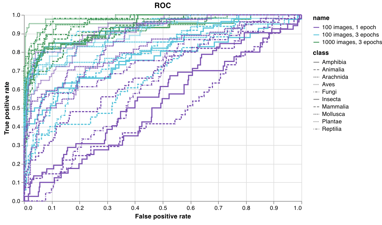 [예제 리포트 보기](https://wandb.ai/wandb/plots/reports/Plot-ROC-Curves--VmlldzoyNjk3MDE) 또는 [예제 Google Colab 노트북 사용해 보기](https://colab.research.google.com/drive/1_RMppCqsA8XInV_jhJz32NCZG6Z5t1RO?usp=sharing).
### 맞춤형 프리셋
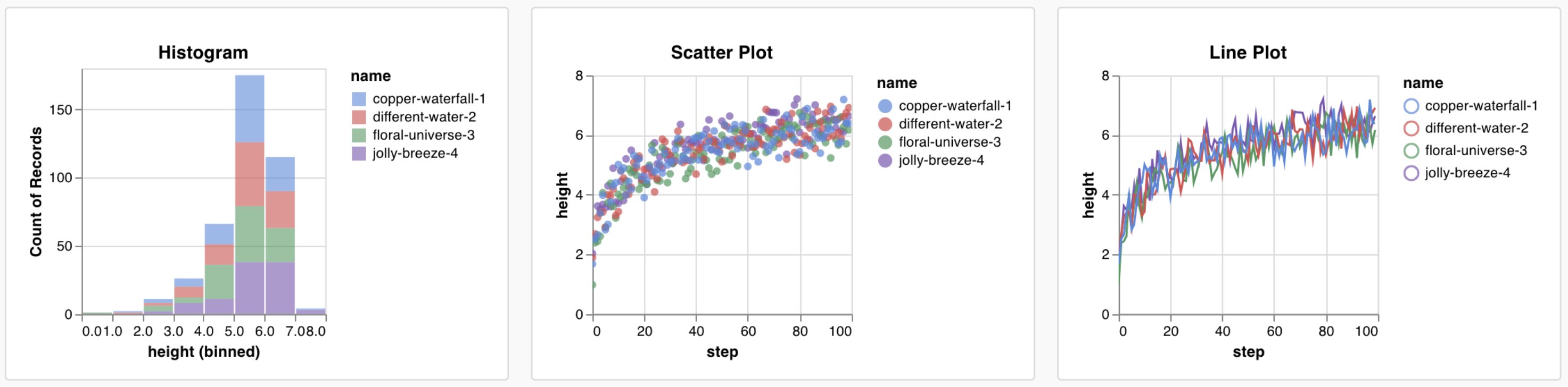
기본 제공 프리셋을 조정하거나 새 프리셋을 만든 다음 차트를 저장하세요. 차트 ID를 사용하면 스크립트에서 바로 해당 맞춤형 프리셋에 데이터를 로깅할 수 있습니다. [예제 Google Colab 노트북을 사용해 보세요](https://tiny.cc/custom-charts).
```python theme={null}
# 플롯할 열이 포함된 테이블 생성
table = wandb.Table(data=data, columns=["step", "height"])
# 테이블의 열을 차트의 필드에 매핑
fields = {"x": "step", "value": "height"}
# 테이블을 사용하여 새 맞춤형 차트 프리셋 채우기
# 저장된 차트 프리셋을 사용하려면 vega_spec_name을 변경하세요
my_custom_chart = wandb.plot_table(
vega_spec_name="carey/new_chart",
data_table=table,
fields=fields,
)
```
## 데이터 로깅
맞춤형 차트에서 무엇이든 시각화하려면 먼저 차트 편집기가 쿼리할 수 있는 형식으로 스크립트가 기반 데이터를 로깅해야 합니다. 스크립트에서 다음 데이터 유형을 로깅하고 맞춤형 차트에서 사용할 수 있습니다.
* **Config**: 실험의 초기 설정(독립 변수)입니다. 여기에는 트레이닝 시작 시 `wandb.Run.config`에 키로 로깅한 모든 이름 있는 필드가 포함됩니다. 예: `wandb.Run.config.learning_rate = 0.0001`
* **Summary**: 트레이닝 중 로깅된 단일 값(결과 또는 종속 변수)입니다. 예를 들어 `wandb.Run.log({"val_acc" : 0.8})`와 같습니다. 트레이닝 중 `wandb.Run.log()`를 통해 이 키에 여러 번 기록하면, summary는 해당 키의 마지막 값으로 설정됩니다.
* **History**: 로깅된 스칼라의 전체 시계열은 `history` 필드를 통해 쿼리할 수 있습니다.
* **summaryTable**: 여러 값의 목록을 로깅해야 한다면 `wandb.Table()`을 사용해 해당 데이터를 저장한 다음, 맞춤형 패널에서 쿼리하세요.
* **historyTable**: 이력 데이터를 확인해야 한다면 맞춤형 차트 패널에서 `historyTable`을 쿼리하세요. `wandb.Table()`을 호출하거나 맞춤형 차트를 로깅할 때마다 해당 step의 이력에 새 테이블이 생성됩니다.
### 맞춤형 테이블 로깅
`wandb.Table()`을 사용해 데이터를 2차원 배열로 로깅합니다. 일반적으로 이 테이블의 각 행은 하나의 데이터 포인트를 나타내며, 각 열은 시각화하려는 각 데이터 포인트의 관련 필드 또는 차원을 나타냅니다. 맞춤형 패널을 설정하면 전체 테이블은 `wandb.Run.log()`에 전달한 키 이름(다음 예시의 `custom_data_table`)으로 접근할 수 있습니다. 개별 필드는 열 이름(`x`, `y`, `z`)으로 접근할 수 있습니다. 실험 전반에 걸쳐 여러 time step에서 테이블을 로깅할 수 있습니다. 각 테이블의 최대 크기는 10,000행입니다. [Google Colab 노트북 예시를 사용해 보세요](https://tiny.cc/custom-charts).
```python theme={null}
with wandb.init() as run:
# 맞춤형 데이터 테이블 로깅
my_custom_data = [[x1, y1, z1], [x2, y2, z2]]
run.log(
{"custom_data_table": wandb.Table(data=my_custom_data, columns=["x", "y", "z"])}
)
```
## 차트 사용자 지정
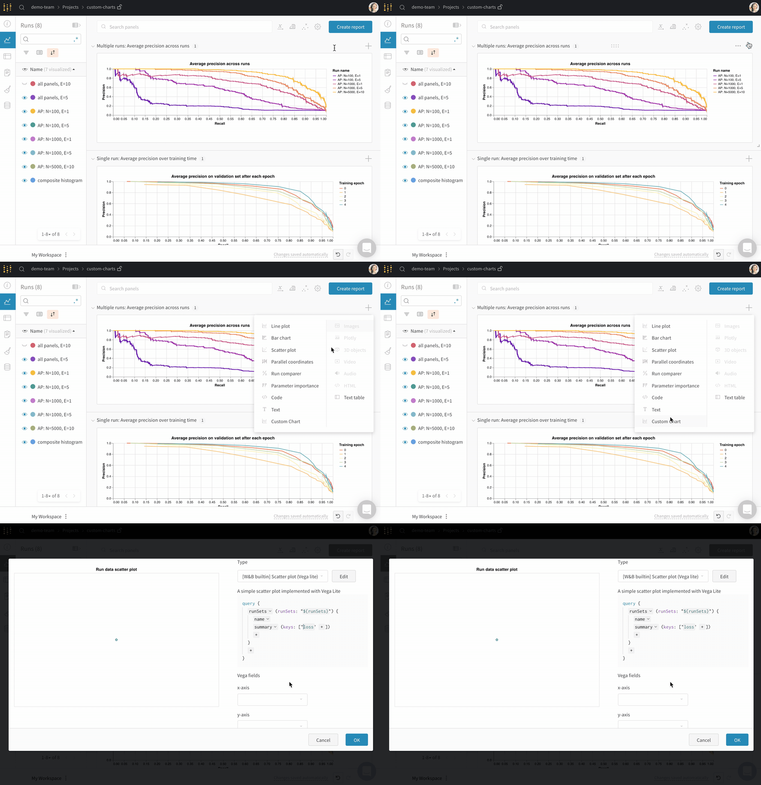
데이터를 로깅한 후, 가져올 로깅된 값과 렌더링 방식을 선택하여 W\&B App에서 차트를 만드세요. 시작하려면 새 맞춤형 차트를 추가한 다음, 표시 중인 Runs에서 데이터를 선택하도록 쿼리를 편집합니다. 이 쿼리는 [GraphQL](https://graphql.org)을 사용해 run의 설정, summary, 이력 필드에서 데이터를 가져옵니다.
### GraphQL 쿼리 작성하기
맞춤형 차트 편집기는 프로젝트 워크스페이스 또는 report에서 선택한 Runs에 대해 GraphQL 쿼리를 실행합니다. 쿼리 편집기에서 필요한 필드를 추가하세요. 대부분의 경우 쿼리를 처음부터 작성하지 않아도 되도록 `config`, `summary`, `history`, `summaryTable`, `historyTable` 중에서 선택할 수 있습니다.
쿼리의 각 source는 서로 다른 로깅 데이터에 매핑됩니다.
* **Config**는 [run configuration](/ko/models/track/config/) 값(하이퍼파라미터 및 기타 설정)을 가져옵니다.
* **Summary**는 [summary](/ko/models/track/log/) 값을 가져옵니다. 기본적으로 `wandb.Run.log()`로 로깅한 키의 summary에는 해당 키에 마지막으로 기록된 값이 저장됩니다. 다른 집계를 사용하려면 `wandb.Run.define_metric(..., summary=...)`를 `"min"`, `"max"`, `"mean"`, `"best"`, 또는 `"none"`과 함께 호출하세요. 값을 직접 설정하려면 `wandb.Run.summary["key"] = value`로 할당하세요.
* **History**는 run 이력에서 스칼라 시계열을 가져옵니다(예: 각 step의 `loss` 또는 `accuracy`). 최종 숫자만이 아니라 전체 곡선이 필요할 때는 **history**를 사용하세요.
* \*\*`summaryTable`\*\*은 run summary에서 [`wandb.Table`](/ko/models/ref/python/data-types/table)을 로드합니다. 관심 있는 테이블이 run에 단일 스냅샷으로 저장되어 있을 때 사용하세요(예: 마지막에 한 번만 로깅하는 confusion matrix).
* \*\*`historyTable`\*\*은 run 이력에서 [`wandb.Table`](/ko/models/ref/python/data-types/table)을 로드합니다. `wandb.Run.log()`로 테이블을 로깅할 때마다 해당 테이블을 포함하는 step이 run 이력에 하나씩 추가됩니다. 테이블이 시간에 따라 바뀌거나 맞춤형 차트 편집기에서 step selector를 활성화하려는 경우 \*\*`historyTable`\*\*을 사용하세요([맞춤형 차트에 step slider를 표시하려면 어떻게 해야 하나요?](/ko/support/models/articles/how-do-you-show-a-step-slider-in-a-custo) 참고).
\*\*`summaryTable`\*\*과 \*\*`historyTable`\*\*의 경우, \*\*`tableKey`\*\*는 [`wandb.Table`](/ko/models/ref/python/data-types/table) 내부의 column 이름이 아니라 `wandb.Run.log()` 안에서 사용한 dictionary 키로 설정하세요.
다음 예시는 일반적인 사용 사례를 다룹니다.
* 각 step에서 로깅하는 테이블의 column을 plot하려는 경우(예: PR curve): \*\*`historyTable`\*\*을 추가하고 \*\*`tableKey`\*\*를 로깅한 키로 설정한 다음(예: `pr_curve`), **Chart fields**에서 테이블 column을 매핑하세요. [맞춤형 차트 워크스루](/ko/models/app/features/custom-charts/walkthrough)를 참고하세요.
* summary에 있는 테이블의 column을 plot하려는 경우(예: composite histogram용 class scores): \*\*`summaryTable`\*\*을 추가하고 \*\*`tableKey`\*\*를 해당 키로 설정하세요(튜토리얼에서는 `class_scores`를 사용). [Bonus: composite histograms](/ko/models/app/features/custom-charts/walkthrough#bonus-composite-histograms)를 참고하세요.
* 트레이닝 step에 따른 스칼라 metric을 plot하려는 경우: **history**에서 해당 metric을 추가하세요. **summary**에서만 추가하면 차트에는 run별로 단일 값만 표시됩니다.
**차트 필드 이름**
쿼리가 실행되면 **Chart fields**에 Vega spec에 바인딩할 수 있는 column이 나열됩니다. 이름은 보통 `runSets_`로 시작하며 선택한 쿼리 필드를 반영합니다. 직접 입력하지 말고 각 `${field:...}` placeholder 옆의 드롭다운에서 선택하세요.
column이 전혀 나타나지 않으면 선택한 Runs에 해당 키가 있는지 확인하고, run 페이지를 열어 데이터가 어떻게 로깅되었는지 확인한 다음, \*\*`summaryTable`\*\*과 **`historyTable`** 중 어떤 것이 해당 로깅 패턴에 맞는지 점검하세요.
맞춤형 차트는 이 GraphQL 기반 panel query를 사용합니다. [Query panels](/ko/models/app/features/panels/query-panels)은 다른 표현식 언어를 사용하며 별도로 문서화되어 있습니다.
### 맞춤형 시각화
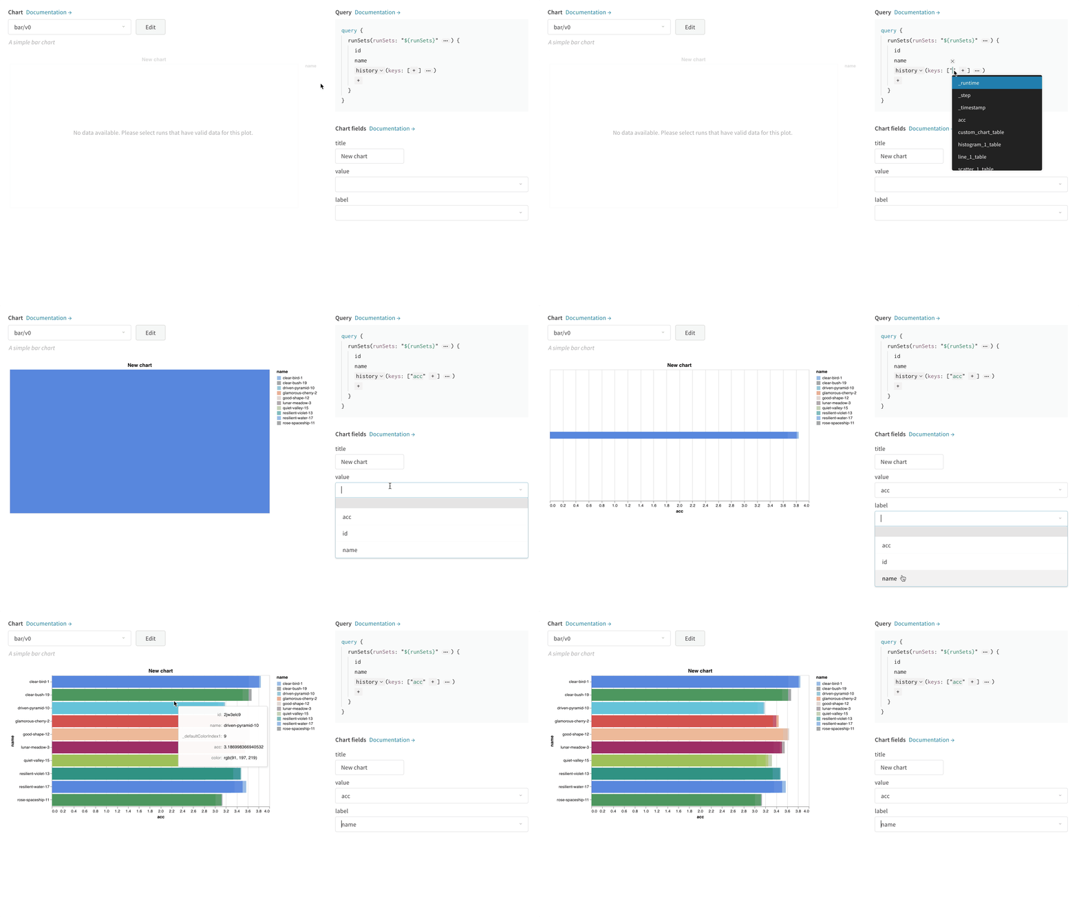
우측 상단에서 **Chart**를 선택해 기본 프리셋으로 시작합니다. 다음으로 **Chart fields**를 선택하여 쿼리에서 가져온 데이터를 차트의 해당 필드에 매핑합니다.
다음 이미지는 메트릭을 선택한 다음 이를 막대 차트 필드에 매핑하는 방법을 보여줍니다.
### Vega 편집
패널 상단의 **Edit**를 클릭해 [Vega](https://vega.github.io/vega/) 편집 모드로 들어갑니다. 여기에서 UI에서 대화형 차트를 만드는 [Vega specification](https://vega.github.io/vega/docs/specification/)을 정의할 수 있습니다. 차트의 모든 요소를 변경할 수 있습니다. 예를 들어 제목을 바꾸거나, 다른 색상 구성표를 선택하거나, 곡선을 연결된 선 대신 일련의 점으로 표시할 수 있습니다. 또한 Vega transform을 사용해 값 배열을 히스토그램으로 binning하는 것처럼 데이터 자체를 변경할 수도 있습니다. 패널 미리보기는 대화형으로 업데이트되므로 Vega 사양이나 쿼리를 편집하면서 변경 사항이 어떻게 반영되는지 확인할 수 있습니다. 자세한 내용은 [Vega documentation and tutorials](https://vega.github.io/vega/)을 참조하세요.
**필드 참조**
W\&B의 데이터를 차트에 가져오려면 Vega 사양의 아무 위치에나 `"${field:}"` 형식의 템플릿 문자열을 추가하세요. 그러면 오른쪽의 **Chart fields** 영역에 드롭다운이 생성되고, 이를 사용해 Vega에 매핑할 쿼리 결과 열을 선택할 수 있습니다.
필드의 기본값을 설정하려면 다음 구문을 사용하세요: `"${field::}"`
### 차트 프리셋 저장
프리셋을 저장하면 매번 다시 만들지 않고도 패널과 프로젝트 전반에서 동일한 Vega 정의를 재사용할 수 있습니다. 모달 하단의 버튼을 사용해 특정 시각화 패널에 변경 사항을 적용합니다. 또는 Vega 사양을 저장해 프로젝트의 다른 곳에서도 사용할 수 있습니다. 재사용 가능한 차트 정의를 저장하려면 Vega 편집기 상단의 **다른 이름으로 저장**을 클릭한 다음 프리셋 이름을 지정하세요.
## Reports 및 가이드
다음 Reports에서는 실제 맞춤형 차트 활용을 보여 주는 엔드투엔드 예시와 더 심층적인 탐구를 확인할 수 있습니다.
* [W\&B 머신 러닝 시각화 IDE](https://wandb.ai/wandb/posts/reports/The-W-B-Machine-Learning-Visualization-IDE--VmlldzoyNjk3Nzg)
* [맞춤형 차트를 사용해 NLP 어텐션 기반 모델 시각화하기](https://wandb.ai/kylegoyette/gradientsandtranslation2/reports/Visualizing-NLP-Attention-Based-Models-Using-Custom-Charts--VmlldzoyNjg2MjM)
* [맞춤형 차트를 사용해 어텐션이 그라디언트 흐름에 미치는 영향 시각화하기](https://wandb.ai/kylegoyette/gradientsandtranslation/reports/Visualizing-The-Effect-of-Attention-on-Gradient-Flow-Using-Custom-Charts--VmlldzoyNjg1NDg)
* [임의의 곡선 로깅하기](https://wandb.ai/stacey/presets/reports/Logging-Arbitrary-Curves--VmlldzoyNzQyMzA)
## 일반적인 사용 사례
맞춤형 차트는 기본 Panel로는 필요한 내용을 표현할 수 없을 때 유용합니다. 예를 들면 다음과 같습니다.
* 오차 막대가 있는 막대 플롯을 맞춤 설정
* 맞춤형 x-y 좌표가 필요한 모델 검증 메트릭 표시(예: precision-recall curve)
* 서로 다른 두 모델 또는 실험의 데이터 분포를 히스토그램으로 겹쳐 표시
* 트레이닝 중 여러 시점의 스냅샷을 통해 메트릭 변화를 표시
* W\&B에서 아직 사용할 수 없는 고유한 시각화를 만들어 다른 사람과 공유